“Why isn’t the web like a magazine?” said Larry Page, co-founder of Google.
He strived to make Google Search an experience with as close to zero latency as possible. You enter a search query, press enter, and like turning the page of a magazine, BOOM, there’s more delightful content.

Larry’s aspiration showcases his intuitive grasp of two persuasive design principles:
- Help people do what they already want to do, i.e., find relevant content
- Design digital products that are as easy as possible to use
We’ll explore the surprising potency of these ideas we go deep on the Fogg Behavior Model — the preeminent framework for persuasive design.
What is Persuasive Design?
BJ Fogg is a behavioral scientist out of Stanford who many consider the godfather of persuasive design (a rather mafia-esque distinction).
Definition: Persuasive design, a form of applied psychology, refers to a set of methods for nudging users to take actions
To really grok this term it helps to consider an analogy.
We’ve all know what it’s like to not want to interact with a salesperson while shopping. While they may be pleasant, our consumer spidey sense tells us they want something from us.
And they do. Understandably, they’re looking to make a sale — it’s their job.
To get you to whip out your credit card, they might appeal to scarcity. For instance, they could urge you to buy a pair of shoes ONLY ON SALE FOR 48 HOURS. Alternatively, the store itself might create a membership program so making a purchase is as simple as pressing a button. After all, your credit card is already on file.
Now imagine we could wave a wand and automate our storefront, salesperson and all. That’s how persuasive design typically works in the booming sector that is eCommerce. Companies can write convincing copy, tactfully put it on their site, and have a server automatically disseminate their messages at scale.
It sounds so easy, but Fogg claims the vast majority of attempts at persuasive design fail. Indeed, 80 to 97 percent of eCommerce stores go under, a sobering statistic.
While there are many reasons for this, one stands out: product designers often struggle to think clearly about behavior — an essential ingredient for success in any industry.
An Overview: The Fogg Behavior Model
“Simplicity is the key to behavior change,” says Fogg. His pithy wisdom stems from twenty years of industry experience with companies like Instagram, WeightWatchers, and more.
He’s not making this stuff up, and nowhere is that more apparent than his widely cited model of behavior:
The Fogg Model optimizes for a behavior. I’m not talking about an aspiration here, like building a business. If I were to say ‘build a business right now’ you probably wouldn’t know what to do with yourself.
Building a business is not a behavior — that is, some discrete action you can take. Behaviors to grow a company would be something like pick up the phone, enter the number of a potential client, and answer any questions they have about your offer.
It’s crucial you have a specific behavior in mind to get the most out of this model.
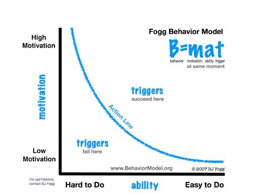
Now that we’ve clarified behavior we can consider the factors that fuel it:
- Motivation: The degree to which a person desires to engage in a behavior (what most people focus on).
- Ability: The degree to which a behavior is easy to engage in (walking 10 feet is easy, running a marathon is hard).
- Prompt: A nudge to engage in a behavior whether it be an external notification or an internal urge like to use the restroom.
Motivation and ability must cross a certain threshold before a prompt is sufficient to induce a behavior.
For instance, take someone that doesn’t want to run because it’s painful, and can’t because there are 2 feet of snow outside. Even if their FitBit prompts them to go for a jog, the run probably isn’t going to happen.
Here’ where things get interesting.
There are situations when someone will go for a run in 2 feet of snow. It’s when motivation is so high that it makes up for lack of ability. Researchers call this a compensatory relationship — comparing motivation and ability to 2 ends of a seesaw.
Just like motivation can outweigh ability, ability can outweigh motivation.
For instance, take a $1 ebook on Amazon Kindle. Maybe I don’t want the book so bad; I really could take it or leave it so my motivation is low. But since my ability to pay is high, especially with ‘1-click’ purchasing, I buy it anyways.
In other words, a user might be lukewarm about taking an action but if it’s easy enough, they’ll do it. That is the power of simplicity.
Ability: Four Factors That Make Behaviors More or Less Simple
Ability, the crux of the model, refers to how easy a behavior is. To bring home this point, consider an example from Fogg’s book Tiny Habits.
Suppose there’s a site that has an intermediate level math problem which one must complete to access a prize. For a person who struggles with math their ability to access the prize would be low — even if they desired it.
They could increase their ability to get the prize by seeking the help of a math whiz friend.
The takeaway? Ability is relative to peoples’ circumstances and skills. We’ll see this repeatedly as we dissect four factors that shape ability.
Brain Cycles
The more a person has to mentally strain themselves to engage in a behavior, the less likely they are to take that action.
Don’t make me think! is the #1 bestselling book on user experience and website usability. Makes sense, effortful thinking is hard — whether it be to sign-up, donate, or make a purchase.

For instance, a user probably doesn’t want to exert brain cells to think about where they put their credit card.
Is it in my wallet? No. Where did I have it last? Hmmmm
Instead, they’d rather have their credit card information automatically fill in.
Based on this example, it’d be easy to get baited into the GoldFish Hypothesis: users are more distractible than a goldfish, so we shouldn’t require them to think.
This notion, however popular, is too extreme. Many individuals not only enjoy, but demand, content that is intellectual — especially on a blog.
Yet consider what many copywriters are told: The average American has an 8th-grade reading level so write at a 7th-grade level and below — that way, your reader will have the ability to easily follow the plot.
This advice is generally sound; however it’s not without its risks because there’s ample room for variability around the 8th-grade average.
For instance, suppose we have two users. One has a first-grade reading level and the other a 17th-grade reading level, meaning they follow written arguments at a graduate level. The average reading level of these two is the 8th grade. If we write at that level though we’ll risk boring the graduate-level reader and confusing the elementary reader.
That’s why we need to be mindful of how cerebral our audience is and produce content accordingly.
Physical Effort
The more a person has to physically strain themselves to engage in a behavior, the less likely they are to take that action.
The appeal of eCommerce is a mystery. I give my credit card number to some company I may barely know and hope that they mail me a product I haven’t even so much as held.
Yet, ecommerce continues to grow rapidly.
But why? One reason is that to buy a product online reduces the physical effort required to go shopping. Now I can purchase everyday staples on Amazon, have UPS deliver them to my door, and save myself from lugging an unwieldy box of paper towels out of Costco.
Convenient, but there a catch. A person who has Amazon send them staple products might feel alienated. They no longer get to speak with a friendly cashier every week — the kind of micro-interactions that can brighten their day.
What’s the alternative?
Increasingly stores like Walmart are adopting a hybrid approach: one that combines the digital and physical. You can order your groceries online then pick them up in-person. This approach reduces physical effort while allowing people to socialize, if only briefly.
Here’s the takeaway: If we mitigate physical effort too much then certain gratifying aspects of an experience, like social interaction, are lost. Amazon saying, “Thank you for your purchase.” just doesn’t cut it.
Social Deviance
The more a person stands out when engaging in a behavior, the less likely they are to take that action.
There’s a mystery about zebras…
Why on earth do they have black and white stripes? You’d think that evolution would select against this conspicuous display because it draws attention from predators.
There’s another angle, called the Crypsis Hypothesis: zebras are striped to blend in with the herd, reducing their visual salience to predators.
Humans may be like zebras in that we anxiously avoid standing out so our reputation isn’t threatened. For this reason, when a user has to diverge from the crowd, their ability doesn’t just fall — it plummets.
Online dating in its early days is a fitting example…
You’re looking for a partner on the web? Huh, that’s weird.
That perception persisted until we normalized using the internet for so many personal activities that online dating became common practice. In fact, one might argue there’s been, or will be, a reversal of social norms: meeting potential partners in person might be what’s weird.
How many people would of saw that coming 20 years ago?
Not many.
The history of online dating reveals how our concept of social deviance sometimes changes drastically, a dynamic that ambitious individuals can capitalize on.
Entrepreneurs gain an edge by predicting what’s deviant today that won’t be 5-10 years from now. That way, they get a headstart on developing solutions — ones that people aren’t yet aware they’re going to feel socially obliged to use.
Now that’s foresight.
Non-Routine
Behaviors that are out of the ordinary are less likely to occur.
There’s a perplexing phenomena.
If you take a square cereal, rotate it 45 degrees, and call it ‘New Diamond Flakes’ people will pay more for it. That’s despite the fact nothing meaningful changed about the cereal.
Behavioral economists call this trivial innovation, a kind of novelty bias. People are willing to pay more for a product labeled as new, even if what is deemed new is inconsequential.
Why, then, do we often find non-routine activities so frustrating? After all, they are more new than typical behaviors, and we love those.
To answer this question, consider Jakob’s law: Users spend most of their time on other people’s sites. Designers often point to this maxim to suggest that we should be careful reinventing the wheel.
The advice is to design ways of completing tasks that are routine for people — like to checkout click the cart icon in the top right (thanks Amazon).
Let’s say we’re contrarians and put the cart icon on the top left. That would cause users to expend too many brain cycles as they fumble around for where to checkout.
Ultimately it’s about striking a balance.
We want a predictable experience that aligns with a user’s experience on past sites, while also appealing to novelty bias with fresh and spicy designs.
It’s an art form to manage this dichotomy, especially for innovative products.
Extreme Non-Routine: Innovative Products
In his classic book The Diffusion of Innovations, Everett Rogers breaks down how cutting-edge products gain market share:

In a nutshell, the adoption of an innovation starts slow; first, it’s mainly technologists who use the new product. Then the masses glom on and adoption increases exponentially — finally, in a begrudging manner, the resistant laggards take up the innovation.
Everett argued that it’s often a herculean challenge for innovative companies to go from having earlier adopters to mainstream success.
It’s a challenging feat, yet some companies pull it off.
How Uber Went Mainstream
When Uber launched the concept was a head-scratcher…
You mean I get into a car with a complete stranger? Isn’t that hitchhiking?
The Uber team aimed for people to adopt a behavior that was non-routine because people had it ingrained in them to call taxis.
To overcome this roadblock, Uber was shrewd: they designed their interface to be highly usable. Keep in mind, this was back in 2011 when user experience wasn’t nearly as big as it is now.
The team followed classic usability principles like ‘keep the state of the system visible.’ For instance, they displayed where the user’s Uber driver was on a map so there were no doubts their ride was coming.

Features like this catapulted calling an Uber above the ability threshold necessary for widespread adoption.
The final piece of the puzzle following Fogg’s first law of behavior change: help people do what they already want to do (more on this later).
Users already wanted a convenient — indeed, borderline magical — ride at the tip of their fingertips, especially given the many inconveniences of taxis.
There was no going back to brusque cab drivers after the convenience of Uber.
Users we’re hooked.
In sum, Uber made an easy-to-use product that people wanted. This synergy allowed them to get users over the hurdle of adopting a non-routine behavior, calling an Uber. The result? The elusive achievement of mainstream adoption.
The Strengths and Weaknesses of Motivation
We put motivation on a pedestal in our culture…
And perhaps we should. Motivation has infused people with the strength to accomplish herculean feats.
Take David Goggins — an elite ultramarathon runner, best selling author, and former Navy Seal. His childhood was fraught with difficulties including abuse and poverty, yet by sheer force of will he went on to inspire millions.
No question motivation is powerful. But as Fogg notes, it’s not all it’s cracked up to be. The problem with motivation is that it comes and it goes, researchers call this the motivation wave.
Take online courses as an example. 90% of people who sign up for these classes never complete them. They fly through the first lessons, a few days go by, and they lose interest.
Motivation is fickle, but its flames can be stoked. There are 3 types of motivational appeals: pleasure/pain, hope/fear, and social acceptance/rejection.
To describe the machinery of each I’ll use examples from Optinmonster, a landing page builder. I choose this platform because it’s a microcosm for all things persuasion on the web.
Put another way, what Optinmonster does is likely indicative of the techniques other sites use to persuade.
Let’s dive in.
Pleasure/Pain
Freud famously proposed the pleasure principle: the simple idea that humans move away from pain and towards pleasure, at every turn. He was pointing to a primitive drive — one that’s shared by all of us.
OptinMonster capitalizes on this aspect of human psychology by implicitly hinting at pleasure.

Here’s the subtext of this copy: you’ll get our service, trigger the ‘OptinMonster effect’, and experience a rush of dopamine as your email list skyrockets.
Persuasive design is often subtle in this way. A company probably wouldn’t say, “If you use our product then you’re going to feel really good.” That’s just too direct to be effective.
Instead, they dangle in front of us what they know we want with the implication that we’ll be elated when we get it.
Hope/Fear

Humans are profoundly averse to loss. Indeed, Nobel Prize winning psychologist Daniel Kahneman has shown that losses hurt about twice as much as equal gains. Put another way, we need 2 units of gain to compensate for 1 unit of loss.
Due to this dynamic, copy on the web often stokes our fears to change behavior.
Check out the small text under the OptinMonster button. It evokes marketers’ fear of letting revenue “slip by!”
Consider the connotation here by noting what else slips by — immensely valuable things like precious moments in life that we cannot get back. When reflecting on this negative undertone, it makes you wonder how this copy came to be.
My hunch is that they ran A/B tests. They might have manipulated versions of the button copy by having one framed positive and the other negative — a common test. The data likely bore out that the negatively framed version converted more so they stuck with it.
Through blind split-testing, rather than psychological theory directly, messaging often ends up negative.
Social Acceptance/Rejection
The desire fit in hits its apex in highschool…
In fact, social neuroscientists have shown that during adolescents the parts of our brain for self-perception overlap with the parts for how others perceive us.
“I am not what I think I am, and I am not what you think I am. I am what I think you think I am.”
This wiring never really goes away. As social primates, a desire to fit in is built into us like a car’s spark plug. Persuasive design doesn’t merely acknowledge this aspect of our nature, it puts it up on the altar for worship.

Just look at Optinmonster’s landing page. They note the million-plus sites that use their tool, including Harvard (optimizing the Alumni donation page?).
Again we’re dealing with subtleties. If over a million people use this service, then if you do, that implies your behavior is acceptable to a million-plus people.
The possibility of acceptance, even if it’s just implied, heightens our hunger to use a service.
Motivation Wrap Up: Picking the Right Behavior
Mike Kreiger noticed a gap…
The image sharing market was filled with apps like Flickr that made it cumbersome to apply filters.
Kreiger — a student of Fogg’s — saw this as an opportunity. He realized that when we apply image filters there’s no delay, no when-will-this-kick-in, just an immediate hit of gratification from a small tsunami of social approval.
Who could resist that?
Seeing his chance, Kreiger worked tirelessly to build an app that made it simple to add filters. He even went so far as to wake up in the middle of the night to fix Instagram after it had crashed.
His efforts paid off.
He was able to sell his company Instagram to Facebook for a whopping 1 billion dollars just a few years later, and with only a dozen employees.
We can attribute Kreiger’s success, in part, to his choice of behavior — uploading and embellishing photos. Since it’s an activity that people already wanted to engage in, he dodged the many pitfalls of having to actively persuade people to use his product.
Reactance: When Persuasion Backfires
Fogg harps on making things simple because if a team relies too much on motivating people they risk users getting defensive.
Social psychologists call this reactance: The angry and skeptical reaction people experience when they think another person is attempting to limit their freedom.
Think of it this way: A person has a panoply of options upon visiting a used car lot. When the salesman approaches the buyer might react with skepticism because they think the seller is going to limit the set of options they can choose from.
That’s reactance in action.
This effect is especially likely to occur when the persuader frames messages in terms of loss. For instance, “If you don’t buy a car today you’ll lose out on our sale.”
Also, messages that use forceful words such as ‘should’ and ‘must’ tend to amplify reactance. Perhaps that’s why many parents are admonished to stop “shoulding” their children.
It tends to backfire.
To shed more light on this concept, consider a ubiquitous reactance trigger: the pop-up. These design elements are needy, nettlesome, and sometimes nefarious making it no suprise that they’re the #1 most disliked marketing tactic.
To find out why let’s breakdown an example.

First, the most visually salient copy says, “Ouch — That’s Abandonment.” I get that it’s a pun; abandonment means both leaving a site and a person. But let’s turn on our linguistic x-ray vision.
Abandonment has connotations of deep emotional pain, like the kind people experience after a father walks out on them. To me, this undertone feels like a low blow.
Second, look at the buttons. One option is to get started and the other is to ask questions.
But who said I have questions?
This pop-up elicits defensiveness because it sneakily presents a false dichotomy: either you are ready to join the service, or have questions. What’s excluded is the obvious third option — I don’t have any questions and am disinterested in the tool.
Consider the buttons in terms of the following idea: we perceive sites as though they were a person, Fogg calls this the Computers as Social Actors hypothesis. In-person, the Optinmonster buttons would work like this…
An acquaintance has a birthday party coming up. Exciting!
They say to you, “We can either have the party at your house, or you can ask me questions about how we’re going to throw the party at your house.”
This not-even-subtle manipulation may lead you to cut ties with this individual — an action analogous to bouncing from a site.
In summary, attempts at persuasion often backfire. It’s vastly superior to start with a product that people are already motivated to engage with then remind them about it tactfully.
Prompt
It’s the promptapocalypse.
I recently cleaned out my email and found I had over 20,000 emails from companies in my promotions folder. Can you top that? Honestly, I wouldn’t be surprised.
Prompts are omnipresent: our browsers ping; our phones are lit up like Christmas trees; and our operating system wants to talk.
One sec I got a text…
Alright, I’m back.
As I was saying, we are inundated by prompts, which we can define as any nudge to take an action. The most obvious of which is a notification, like what you get from Facebook when tagged in a photo.
Broadly speaking prompts can fall into one of three categories: sparks, facilitators, and signals.
Sparks: Kicking Motivation Up a Notch
A spark is a prompt that attempts to spark your motivation. That is, raise your motivation above the threshold necessary to take an action.
Here’s an example in an email from ButcherBox, a subscription service that provides sustainable grass-fed meats.

There’s two attempts to raise motivation in this prompt.
Can you spot them?
- Appeal to Fear: ButchBox stokes our aversion to loss with “Don’t miss your chance.” This is more tactful than OptinMonster’s use of the phrase “slip by” because the connotations are more palatable.
- Appeal to Scarcity: This attempt is salient with the ominous countdown timer. It almost looks like I have 1 hour, 10 minutes, and 58 seconds to defuse a bomb. In reality, they just want me to buy some turkey.
These types of prompts are perhaps the riskiest because they often…
- Elicit defensive reactions, i.e., reactance
- End up in the spam folder (that’s where Butcher Box’s email was for me)
- Encourage users to place the company sending the spark in their mental filing folder for “companies I should tune out.”
Put simply, too many sparks can hurt a brand.
Note: it’s possible for a company like ButcherBox to experience some or all of these downsides, and still improve their conversion rates with these emails.
That’s because these types of persuasive appeals ‘work’ — hence why your inbox is full of them. However, they come with risks that are difficult to track.
There’s no out-of-the-box dashboard that monitors how different persuasive appeals impact a brand. Conversions like click-through rate are a different story; they’re easily monitored using email marketing software such as MailChimp.
Problems arise when teams game conversion rates using sparks without considering its effect on their brand.
Facilitators: Making Things Easier
A facilitator is a prompt that makes it simpler to complete a behavior. In other words, it raises ability.
One example of facilitators are prompts to add a site to your home screen. Maybe you’ve seen these before. They’re used to initiate a Progressive Web App (PWAs): a website that functions like a native app on a person’s phone, and performs well offline.
Prompts for these apps raise ability by making it easier to visit a site offline. These prompts, while better than sparks, can backfire as well.
If the facilitator prompt attempts to make it simpler to engage in a behavior someone already finds easy then it might annoy them.
For instance, consider a math app. The service emails students a few arithmetic practice problems to help them prepare for an exam. For kids ages 5 to 9, this would be appropriate, but for an educated adult it’d be patronizing.
From this example, we get a helpful guideline: facilitators should raise users’ ability for tasks that are at least somewhat difficult, not trivially easy.
Signals: Prompts for When Conditions Are Ripe
Signals are the holy grail of prompts. They occur when the user has sufficiently high ability and motivation to take an action.
For instance, suppose Beth gets a notification from Instagram. She was tagged in a post! Beth’s curiosity starts as a small fire then builds till it’s a roaring blaze. She looks at her watch: Okay, she thinks, I have time for just a quick check. Beth opens the app, blinks, and an hour has gone by.
This scenario plays out thousands of times a day the world over, from Los Angeles to Tokyo.
Social media apps besiege us with notifications because most of these prompts are signals; if they didn’t send them they’d be leaving engagement on the table.
Simple as that.
Conclusion
We’ve covered a lot so let’s review:
- Persuasive Design: A set of techniques, like scarcity, for nudging people to take actions — often used in eCommerce.
- Fogg Model: If a person’s motivation and ability cross a threshold, and they are prompted to engage in a behavior, then the action will occur.
- The First Law of Behavior Change: Help people do what they already want to do because attempting to increase people’s motivation is risky.
- Motivation Levers: Broadly speaking, the three types of motivators are pleasure/pain, hope/fear, and social acceptance/rejection.
- Types of Prompts: Prompts can either raise motivation like sparks, ability like facilitators, or simply trigger an action when motivation and ability are already high enough i.e. signals.
Those are the big ideas from the Fogg Behavior Model.
While all components of the model are important, those who effectively implement it make increasing ability a main priority.
Remember Larry Page’s question: why can’t the internet be like a magazine? He sought to make his service as easy to use as possible.
And he’s not alone.
Amazon makes purchasing products as easy as a single click. Facebook makes responding to messages as easy as a single tap. Apple makes setting an appointment as easy as a single voice command.
These companies’ secret sauce is making products as low-friction as possible. It’s allowed them to supercharge their efforts at persuasion and reach billions of people.
Now that’s an ability.
References
7 Reasons Why Ecommerce Businesses Fail | TheeCommerce. (2019, October 21). TheeCommerce. https://www.theecommerce.com/blog/why-ecommerce-businesses-fail
Ariely, D., & Jones, S. (2008). Predictably irrational. New York, NY: Harper Audio.
Beepi, I. (2016, July 21). Study: Americans Feel Taken Advantage of at the Car Dealership. Prnewswire.com. https://www.prnewswire.com/news-releases/study-americans-feel-taken-advantage-of-at-the-car-dealership
Fogg, B. J. (2020). Tiny habits: the small changes that change everything. Boston: Houghton Mifflin Harcourt.
Fogg, B. J. (2009, April). A behavior model for persuasive design. In Proceedings of the 4th international Conference on Persuasive Technology (pp. 1-7).
Goggins, D. (2018). Can’t Hurt Me: Master Your Mind and Defy the Odds. Lioncrest Publishing.
Lieberman, M. D. (2013). Social: Why our brains are wired to connect.
Kahneman, D. (2011). Thinking, fast and slow. Macmillan.
Nass, C. I., Moon, Y., & Morkes, J. (1997). Computers Are Social Actors: A Review of Current. Human values and the design of computer technology, (72), 137.
Rogers, Everett (16 August 2003). Diffusion of Innovations, 5th Edition. Simon and Schuster. ISBN 978-0-7432-5823-4.
Steindl C, Jonas E, Sittenthaler S, Traut-Mattausch E, Greenberg J. Understanding Psychological Reactance: New Developments and Findings. Z Psychol. 2015;223(4):205-214. doi:10.1027/2151-2604/a000222
The Most Hated Online Advertising Techniques. (2017). Nielsen Norman Group. https://www.nngroup.com/articles/most-hated-advertising-techniques/
What is readability and why should content editors care about it? (2017, March 22). Centerforplainlanguage.org. https://centerforplainlanguage.org/what-is-readability